A Visual Exploration of Indian Population
Based on 2011 population census data
An example of data and perception guiding the design of a visualization, of India's 2011 population census.
Far better an approximate answer to the right question, which is often vague, than an exact answer to the wrong question, which can always be made precise.
– John W. Tukey, The future of data analysis
Asking good questions, for a data-set, is usually not straight forward. E.g. Which Indian states had more women than men (considering 2011 Indian census). Answer Kerala and Puducherry. But it's just a vanity metrics. More interesting is to ask, why? Why do these states have more women than men? And how does it compare to rest of the states? But more generally, what can help with having better questions?
Data visualizations are one way to come up with good questions. Our visual system is good at picking up certain kinds of patterns. Visualizations attempt at making it easier for eyes (and brain) to notice interesting patterns and anomalies in data. Patterns and anomalies in turn raise questions. This article is one example of designing visualization with our visual perception in mind. We will visualize India's 2011 population census.
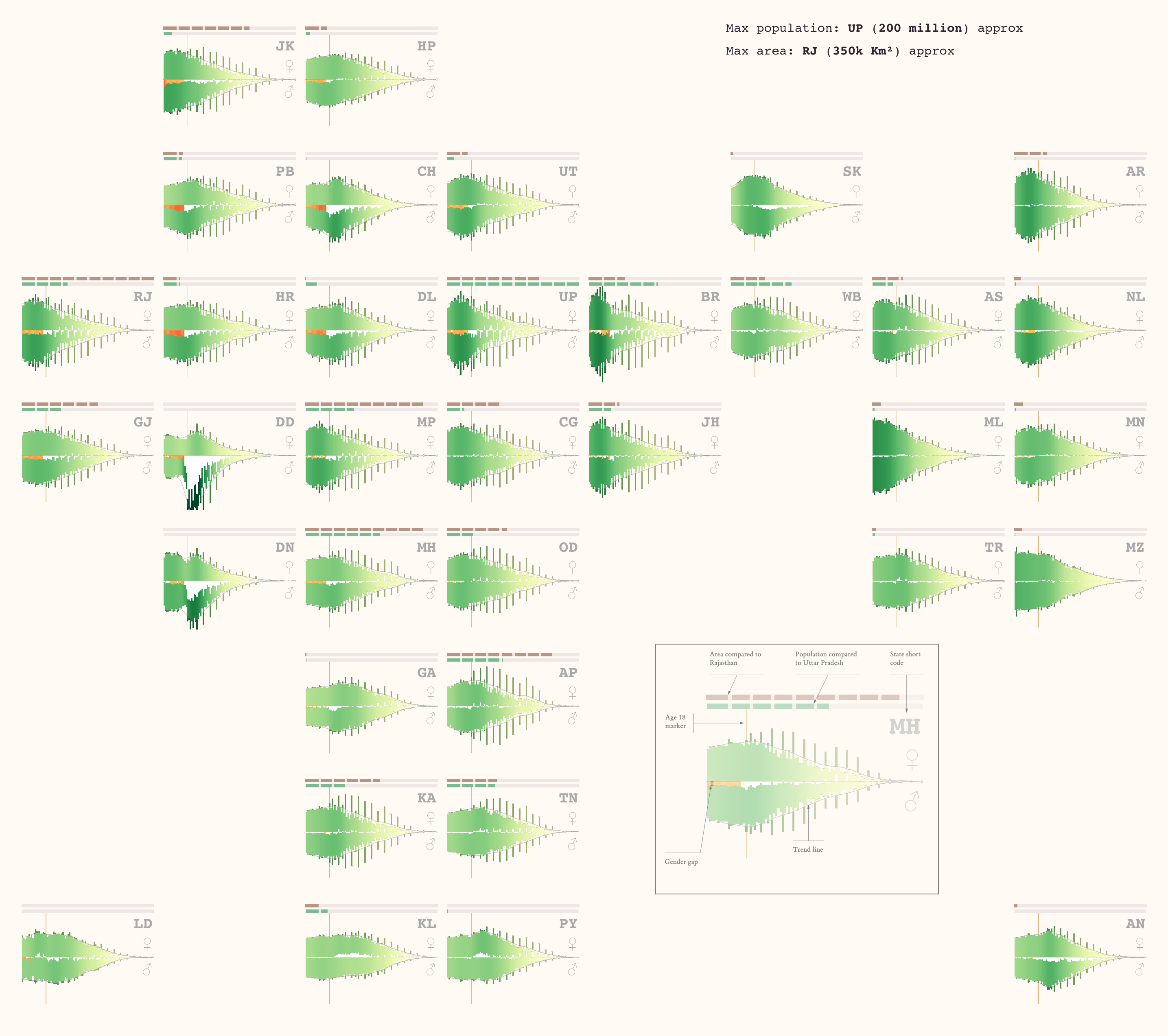
An interactive version of the visualization is at the end of this article. Meanwhile here is an image of the visualization:
This is a dense visualization. But revealing many patterns and anomalies. It takes some effort to interpret, but leads to many questions around the data. I will go through the visualization and reasoning behind it, and keep the observations and questions for another article.
This article has charts and some interactive elements. Reading on a bigger screen might get you more out of the article.
But before getting into the visualization, let's look at the data we will be working with.
It starts with data
India conducts census every 10 year or so. Last census was in 2011. The 2011 census recorded more detailed than previous ones. Of particular interest for this post, 2011 census recorded population by age.
In this article, we will explore the age population distribution at state level. The Indian census for 2011 has data at district level, but to save effort, this post only considers state level data. The original data is from census portal. As an example, here are a few entries from the data that we will be trying to visualize.
| State | Age | Female population | Male population |
|---|---|---|---|
| Bihar | 20 | 1,110,387 | 1,239,346 |
| Jammu & Kashmir | 30 | 152,274 | 163,327 |
| Jammu & Kashmir | 99 | 394 | 285 |
Visualization would also show area of the states, which is again sourced from census data.
Visualizing data
Give a data set, two people are likely to come up with different visualizations, if they go beyond standard bar chart, line chart etc. The space of possible visualizations is big. Even an individual might try many possibilities before deciding on one. Instead of bringing up whole space of my exploration, I will only bring my choices and reasoning behind them.
Population count by age
There are 4 dimensions/attributes we are going to explore. State, age, gender (male/female), size of population. We will start by picking a state (Madhya Pradesh again) and charting age vs population (and add gender later).
Banking to 45°.
The chart has x axis as age, and y axis as the population as a percentage of states total population. E.g. for age 10 . We could have plotted age on x axis. In-fact there is a standard population visualization called population pyramid, where age is plotted on y axis and population on x axis. But comparing horizontal curves with inclines close to ±45° seems to be much easier for our perception.
Age heaping or 0, 5 digit preference
Something to notice right off, is the spikes in population count at certain ages. Especially at ages divisible by 5 and 0. This is a studied phenomenon called digit preference or age heaping. Shading population for ages ending with digits 0 and 5 seems to help notice two patterns. One in general population and one in ages ending with 0 and 5.
Adding gender
Now, let's add the genders. We can start by showing the proportion of each gender, in the vertical bars. for male population (♂), and for female (♀).
Making gender patterns visible
But stacked bar charts make it difficult to see gender pattern for the one stacked above (male population). So, let's flip male population below x-axis.
Gender Gap
An important data point between the genders, is the difference in their population. The bars on x-axis represents the missing population in opposite gender. E.g. white bar below x-axis at age 10 means extra males (or missing females).
Birth Ratio
This leads to another important concern. Birth ratio. Note that the gender ratio is not even close to 1. Apparently humans biologically give birth to more boys than girls. Considering wiki and ourworldindata.org, I will assume 930 girls per 1000 boys to be acceptable birth ratio. For gender ratio lower than 0.93, we will highlight the gap with shades of . That way the extra population stand out. But only till age 15 (or class 10th). We are trying to make sense of birth rate. Assumption is that till age 15, there won't be much movement across sates, of a specific gender (let's say boys moving out for work).
Trend line
The overall population curve for a state, has some pattern (although it's difficult to interpret with the abrupt changes population count with age). To help visually discern this pattern, we fit a trend line over chart. The trend line is calculated with multiple runs of moving average, over the data. It's a visual help, and doesn't have a statistical meaning.
Color gradient
The different colors for the genders don't add much to the perception. When we draw charts for multiple states, we will realize they have different shapes and peaks for the trend line. To help our perception easily notice the peaks, let's use color gradient based on the height of the trend line. The digit preference is still shown in darker color, but only outside the trend line.
Adult age marker
A population could be seen as three generations. The young, the adults and the old. The young are unlikely to migrate to other states. The adults might. And also, adults are birthing the young. The old, again, mostly are settled in a state. To help with comparing the patterns in population curves, across states, we will add a marker for age 18 (an arguable choice).
Small multiples
We will be drawing this chart for multiple states. To differentiate the states, a short code label is added on the top right.
To compare the states better, We will also include the total population and area of states, in the chart. We could show the absolute values for both, but it would be difficult to discern pattern out of totals. Instead, I decided to show the population relative to the most populous state (Uttar Pradesh, 200 million), and are relative to the state having largest area (Rajasthan, 350k km²). Area is shown in brown and population in green lines on top of the chart. Again for perception, these lines have markers. Breaking the line to 10 parts. Each part signifies of the maximum. E.g The population line for Madhya Pradesh looks like ![]() . It has about 3½ green parts. Which means, it's about times the population of UP. And in case of area, Madhya Pradesh is about of Rajasthan.
. It has about 3½ green parts. Which means, it's about times the population of UP. And in case of area, Madhya Pradesh is about of Rajasthan.
This concludes out introduction to the visualization. Now let's look at how the overall population of India, looks in this visualization.
Visualizing India
I will share my observations in another article, except for one around the gender gap. It's interesting that on average, fewer girls are born compared to boys. But that bias in sex ratio doesn't seem to there for older population. Do women survive longer than men? Or was there less birth sex bias in older generations?
More troubling is the number of missing girls. Hover over the chart and you will notice that about 1 million more men were born, compared to women, for each age, till about 25. That's 25 million missing women, below the age of 25. To get a perspective on it, compare it with Bangalore population in 2021. It's estimated to be 13 million. The missing population is about twice the population of Bangalore. Since there is a biological bias for boys, we can't make a conclusion with just this data. Fortunately, we have state level data, to gain more context on this.
Visualizing states of India
Now let's look at the states in India, in 2011.
The states and union territories are visualized as small multiples States are mapped on a grid, based approximately on their geographic location, with some artistic freedom. This way, it is easy to compare neighboring states. Or gain a sense of trends, based on region. Again, the shades of green represent the percentage of population in that age. Darker green for higher percentage. You can click on a state to expand it, and click again to bring it back to it's original size.
I will cover the one question we started with. The states with more females than males. Kerala and Puducherry. Birth ratio in both of them, seems to similar to most other states. In case of Kerala, seems like a portion of adult male population is missing. Likely the Gulf affect. In other words, men are outside, for work. Likely having their wives take care of family. Let's consider Puducherry. Puducherry seems to have population peak in adult age, both male and female. But there are more adult females, than males. I haven't figured out why. Maybe, Puducherry has more women tourists than men? But note that the population is really small to consider it as a significant affect.
There is a lot to observe, and many questions to explore. For example, how does the birth ratio change across states. What are the different shapes for population distribution. Differences based on region. Etc. But enough for this article. I will cover my observations in another article.
Closing thoughts
Better understanding of perception is useful for better visualization. One I use often, is that we like comparisons, not absolutes. There are many more. If you are interested in exploring perception for visualization, here are a few resources I have read/seen (or am planning to read/watch).
- The Science of Visual Data Communication: What Works · Steven L. Franconeri, Lace M. Padilla, Priti Shah, Jeffrey M. Zacks, and Jessica Hullman
- An Algebraic Process for Visualization Design · Gordon Kindlmann, Carlos Scheidegger
- A Survey of Perception-Based Visualization Studies by Task · Ghulam Jilani Quadri, Paul Rosen with accompanying site
- Everything is Seasonal · Zan Armstrong
- Stop aggregating away the signal in your data · Zan Armstrong
- Three Simple, Flexible Tools for Empowered Data Visualization · Zan Armstrong, Outlier 2022
- Perception in Visualization · Christopher G. Healey
Acknowledgement
Thanks to Anantha Kumaran, Saneef, Rahul for help with data and feedback on the article.

